e
i
g
g
a
m

Complete heuristic evaluation and redesign proposal for the digital library catalogue platform of the Ministry of Culture of Spain.

Year 2022

Análisis heurístico

Rebranding

UX/UI Design

Starting point

eBiblio is a free service for borrowing books, audiobooks, newspapers, magazines, educational resources, and audiovisual materials that the libraries and public reading services of the Community of Madrid make available to you.

The problem

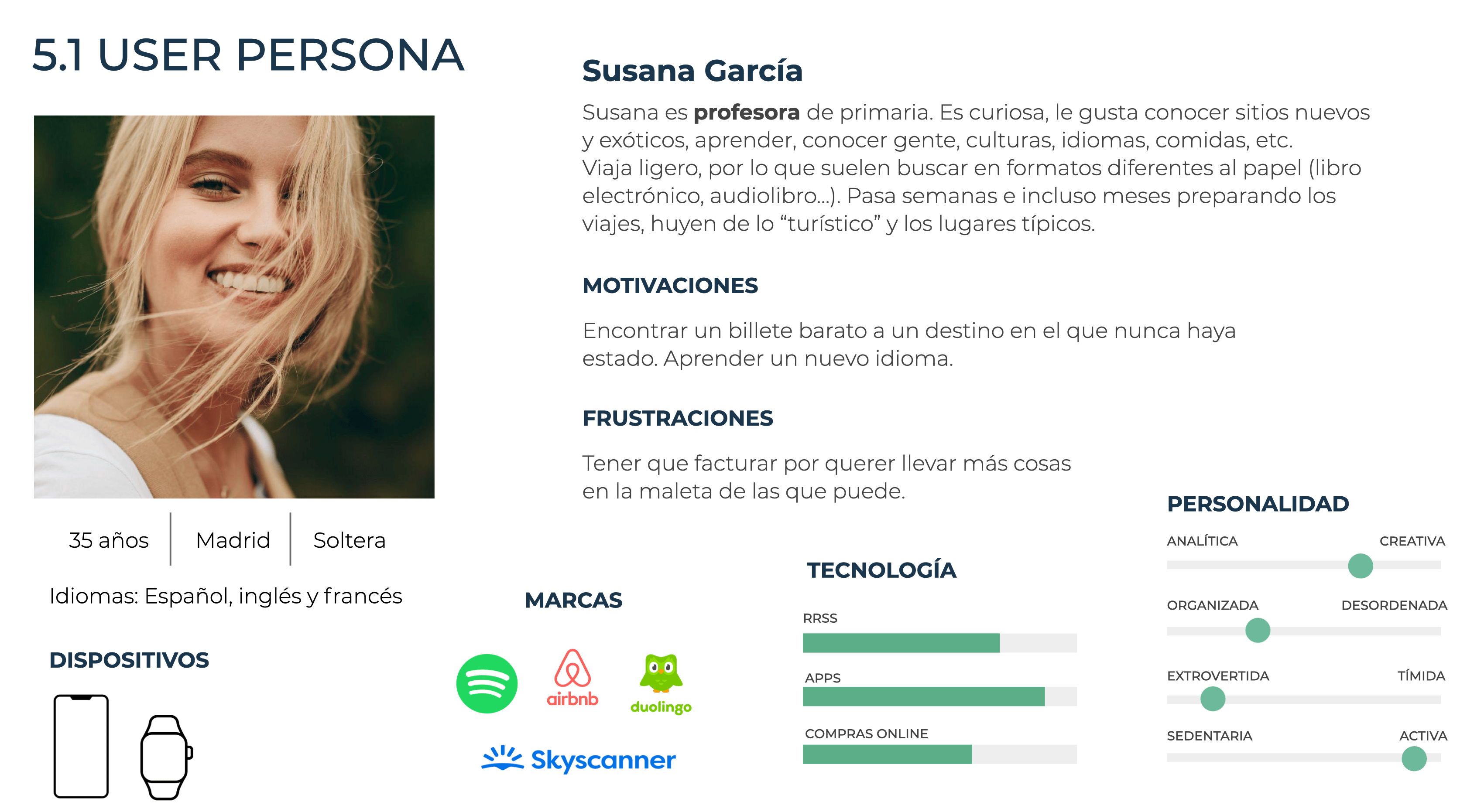
The service offers an extraordinary value proposition; however, its interface does not meet expectations. An inherited UI, lacking coherent visual hierarchy and an information architecture that hindered content discovery, hampered the user experience. This is why La Nave Nodriza requested a complete redesign of the application based on a profile of a travelling user.

The challenge was not just to modernise the appearance, but to rigorously identify which usability principles were being violated, and to propose solutions that addressed the root problems — not just to make them look better.

Audit

Using Jakob Nielsen's 10 heuristic rules as an evaluative framework, I analysed each main screen of the flow: Home, search, book details, and borrowing process. Each finding was categorised by severity (1–4) and type of violated heuristic.
  1. H1

  2. Status Visibility

  3. The system did not inform the user of their active loan status or progress in key workflows.

  1. H4

  2. Consistency and Standards

  3. Inconsistent interaction patterns between sections and non-uniform terminology throughout the platform.

  1. H8

  2. Aesthetic and Minimalist Design

  3. Excess information on screen without clear hierarchy. Each element competing visually for the same attention.

Design Decisions

Every decision made in the proposal directly responds to a finding from the audit. There were no purely aesthetic choices: each change has a functional justification.

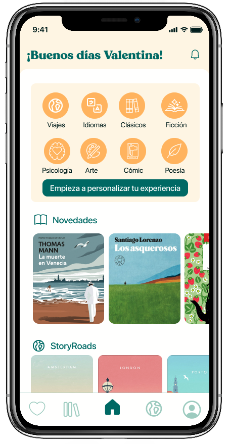
  • New visual hierarchy on the homepage

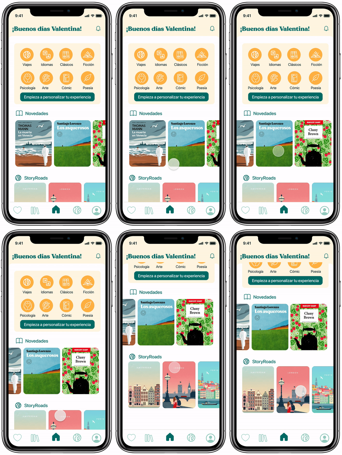
    Redesign of the layout to ensure that editorial content and book discovery are clearly prominent, reducing visual noise and establishing a consistent typographic rhythm.

  • Redefined typographic system

    Implementation of a clear typographic scale with no more than 3 body sizes and 2 weights, eliminating visual fragmentation that hindered reading in the original interface.

  • Reinforced colour identity

    Proposal for a palette consistent with the institutional character of the platform, adding functional accents to guide attention towards the loan CTAs.

  • Search flow and book details

    Redesign of the search component to make it more prominent, and restructuring of the book details to present loan information first — the user's primary goal.

REGISTER

ONBOARDING

LIBRARY

SEARCHER

TODO

AUDIOBOOKS

BOOKS

PRESS

MAGAZINES

DISCOVER

DOWNLOADED

WAITING LIST

FILTERS

STORYROADS

IN YOUR CITY

SR STARTED

ABOUT THAT CITY

MAPA

IN YOUR COUNTRY

NEXT STEP

PROFILE

DATA

SETTINGS

ALARMS

AVAILABLE RESERVATIONS

CURRENT RESERVATIONS

HISTORY

FAVS

SAVED NOTES

BOOKS

AUDIOBOOKS

PUBLISHERS

GENRES

AUTHORS

HOME

READING

NOTIFICATIONS

FAVOURITE CATEGORY

STORYROADS

The design of a public platform cannot afford friction. Every screen is a potential barrier between a citizen and a book.

Decisiones de diseño

Every decision made in the proposal directly responds to a finding from the audit. There were no purely aesthetic choices: every change has a functional justification.

Logo redesign

To redesign the logo, I drew inspiration from serif typefaces, particularly the one most commonly used by the publisher Blackie Books.

logo ebiblio

B

Registration

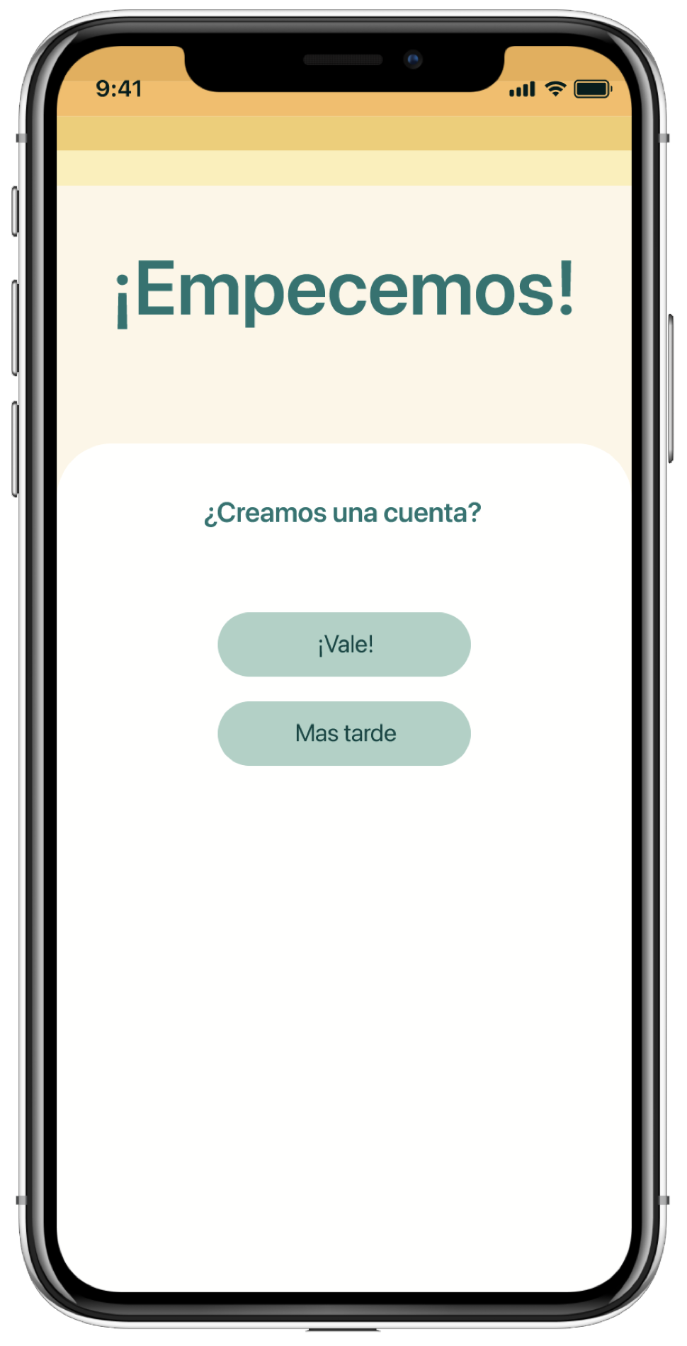
One of the main issues currently facing this service is that to register, you have to do it in person at a library, which posed a problem for our travelling user. So the first change was to enable registration directly from the app.

imagen

Personalisation

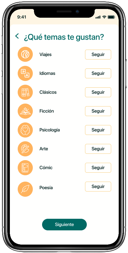
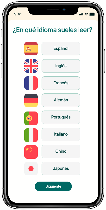
With the aim of achieving a more complete user experience, I have added the ability to configure the profile by selecting categories.

imagen
imagen

Story Roads

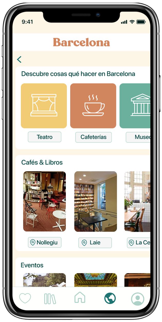
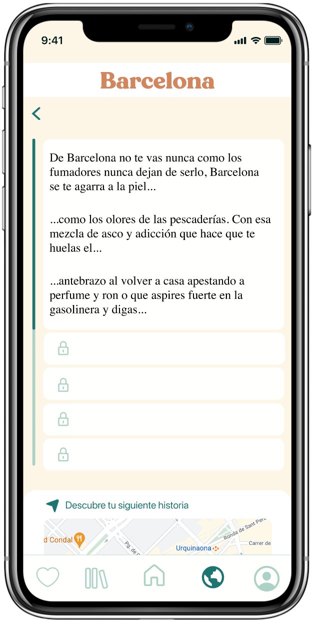
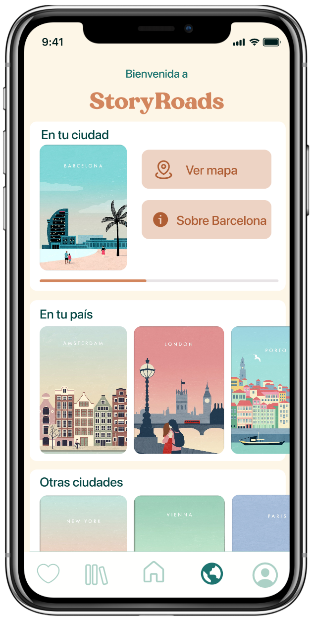
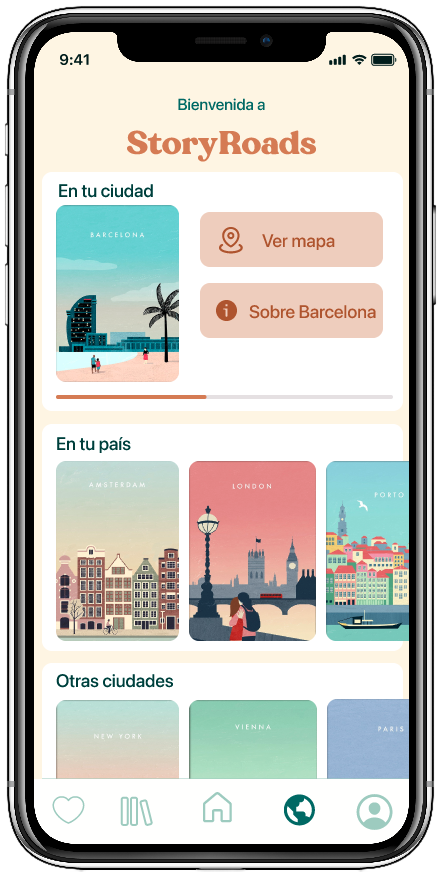
To enhance the user experience during their travels and based on one of the potential areas for improvement, I decided to create a section called StoryRoads.

​

In this section, users will be able to unlock hidden stories behind every corner while they travel and discover the city. It’s a way to connect the city with reading and make the travel experience more enriching.

imagen
imagen
imagen
gif animado

Navigation

Changes within the architecture included:

​

Recommendation of files based on user preferences.

Profile personalisation. Allowing users to categorise their files, create folders to save what interests them most.

Sharing and reading opinions is also important for users; having a rating system enables them to refine their searches and guide other users in theirs.

Story Roads

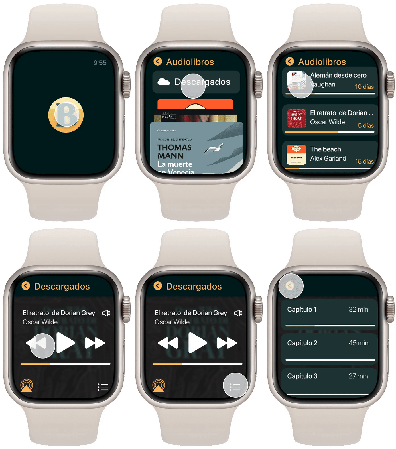
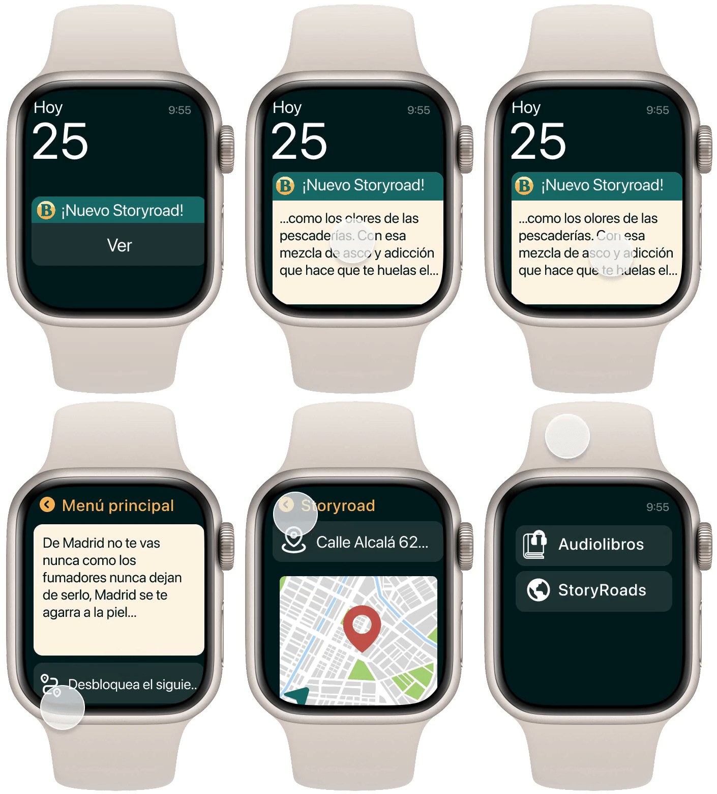
As this user is a traveler, this project also requested the design of the application for a second device. In this case, a smartwatch.

​

Our user travels with little luggage, which is why the smartwatch is a very useful device for her, as it allows her to access audiobooks comfortably and quickly.

The main functionality of this device will be to receive notifications, both for available bookings and for upcoming expirations, approximately the date when a reservation expires.

​

It will also notify when a new Storyroad has been unlocked.

Learning and reflection

Auditing an existing platform is, in many ways, more demanding than designing from scratch. It requires separating the product's inertia from what the user truly needs, and justifying each change against decisions that have a history. This project allowed me to consolidate heuristic analysis as a tool for rigorous diagnosis, not as a checklist, but as a framework for generating defensible design decisions.

The audit is not an end in itself: its value lies in the quality of the bridge between diagnosis and solution. I learned to document not only what was broken, but why it mattered to fix it and what would change if done correctly.

e
i
g
g
a
m

Complete heuristic evaluation and redesign proposal for the digital library catalogue platform of the Ministry of Culture of Spain.

Year 2022

Análisis heurístico

Rebranding

UX/UI Design

Starting point

eBiblio is a free service for borrowing books, audiobooks, newspapers, magazines, educational resources, and audiovisual materials that the libraries and public reading services of the Community of Madrid make available to you.

The problem

The service offers an extraordinary value proposition; however, its interface does not meet expectations. An inherited UI, lacking coherent visual hierarchy and an information architecture that hindered content discovery, hampered the user experience. This is why La Nave Nodriza requested a complete redesign of the application based on a profile of a travelling user.

The challenge was not just to modernise the appearance, but to rigorously identify which usability principles were being violated, and to propose solutions that addressed the root problems — not just to dress them up better.

Audit

Using Jakob Nielsen's 10 heuristic rules as an evaluative framework, I analysed each main screen of the flow: Home, search, book details, and borrowing process. Each finding was categorised by severity (1–4) and type of violated heuristic.

H1

Status Visibility

The system did not inform the user of their active loan status or progress in key workflows.

H4

Consistency and Standards

Inconsistent interaction patterns between sections and non-uniform terminology throughout the platform.

H8

Aesthetic and Minimalist Design

Excess information on screen without clear hierarchy. Each element competing visually for the same attention.

Design Decisions

Every decision made in the proposal directly responds to a finding from the audit. There were no purely aesthetic choices: each change has a functional justification.

  • New visual hierarchy on the homepage

    Redesign of the layout to ensure that editorial content and book discovery are clearly prominent, reducing visual noise and establishing a consistent typographic rhythm.

  • Redefined typographic system

    Implementation of a clear typographic scale with no more than 3 body sizes and 2 weights, eliminating visual fragmentation that hindered reading in the original interface.

  • Reinforced colour identity

    Proposal for a palette consistent with the institutional character of the platform, adding functional accents to guide attention towards the loan CTAs.

  • Search flow and book details

    Redesign of the search component to make it more prominent, and restructuring of the book details to present loan information first — the user's primary goal.

REGISTER

ONBOARDING

LIBRARY

SEARCHER

TODO

AUDIOBOOKS

BOOKS

PRESS

MAGAZINES

DISCOVER

DOWNLOADED

WAITING LIST

FILTERS

STORYROADS

IN YOUR CITY

SR STARTED

ABOUT THAT CITY

MAPA

IN YOUR COUNTRY

NEXT STEP

PROFILE

DATA

SETTINGS

ALARMS

AVAILABLE RESERVATIONS

CURRENT RESERVATIONS

HISTORY

FAVS

SAVED NOTES

BOOKS

AUDIOBOOKS

PUBLISHERS

GENRES

AUTHORS

HOME

READING

NOTIFICATIONS

FAVOURITE CATEGORY

STORYROADS

The design of a public platform cannot afford friction. Every screen is a potential barrier between a citizen and a book.

Decisiones de diseño

Every decision made in the proposal directly responds to a finding from the audit. There were no purely aesthetic choices: every change has a functional justification.

B

Logo redesign

To redesign the logo, I drew inspiration from serif typefaces, particularly the one most commonly used by the publisher Blackie Books.

Registration

One of the main issues currently facing this service is that to register, you have to do it in person at a library, which posed a problem for our travelling user. So the first change was to enable registration directly from the app.

Personalisation

With the aim of achieving a more complete user experience, I have added the ability to configure the profile by selecting categories.

Story Roads

To enhance the user experience during their travels and based on one of the possible areas for improvement, I decided to create a section called StoryRoads.

​

In this section, users will be able to unlock hidden stories behind every corner while they travel and discover the city. It’s a way to connect the city with reading and make the travel experience more enriching.

Navigation

Changes within the architecture included:

​

Recommendation of files based on user preferences.

Profile personalisation. Allowing users to categorise their files, create folders to save what interests them most.

Sharing and reading opinions is also important for users; having a rating system enables them to refine their searches and guide other users in theirs.

Story Roads

As this user is a traveler, this project also requested the design of the application for a second device. In this case, a smartwatch.

​

Our user travels with little luggage, which is why the smartwatch is a very useful device for her, as it allows her to access audiobooks comfortably and quickly.

The main functionality of this device will be to receive notifications, both for available bookings and for upcoming expirations, approximately the date when a reservation expires.

​

It will also notify when a new Storyroad has been unlocked.

Learning and reflection

Auditing an existing platform is, in many ways, more demanding than designing from scratch. It requires separating the product's inertia from what the user truly needs, and justifying each change against decisions that have a history. This project allowed me to consolidate heuristic analysis as a tool for rigorous diagnosis, not as a checklist, but as a framework for generating defensible design decisions.

The audit is not an end in itself: its value lies in the quality of the bridge between diagnosis and solution. I learned to document not only what was broken, but why it mattered to fix it and what would change if done correctly.

e
i
g
g
a
m

Complete heuristic evaluation and redesign proposal for the digital library catalogue platform of the Ministry of Culture of Spain.

Year 2022

Heuristic analysis

Redesign

UX/UI Design

Starting point

eBiblio is a free service for borrowing books, audiobooks, newspapers, magazines, educational resources, and audiovisual materials that the libraries and public reading services of the Community of Madrid make available to you.

The problem

The service offers an extraordinary value proposition; however, its interface does not meet expectations. An inherited UI, lacking coherent visual hierarchy and an information architecture that hindered content discovery, hampered the user experience. This is why La Nave Nodriza requested a complete redesign of the application based on a profile of a travelling user.

The challenge was not only to modernise the appearance but also to rigorously identify which usability principles were being violated and to propose solutions that addressed the root problems — not just to dress them up better.

Audit

Using Jakob Nielsen's 10 heuristic rules as an evaluative framework, I analysed each main screen of the flow: Home, search, book details, and borrowing process. Each finding was categorised by severity (1–4) and type of violated heuristic.

H1

Status Visibility

The system did not inform the user of their active loan status or progress in key workflows.

H4

Consistency and Standards

Inconsistent interaction patterns between sections and non-uniform terminology throughout the platform.

H8

Aesthetic and Minimalist Design

Excess information on screen without clear hierarchy. Each element competing visually for the same attention.

user persona

Design Decisions

Every decision made in the proposal directly responds to a finding from the audit. There were no purely aesthetic choices: each change has a functional justification.

  • New visual hierarchy on the homepage

    Redesign of the layout to ensure that editorial content and book discovery are clearly prominent, reducing visual noise and establishing a consistent typographic rhythm.

  • Redefined typographic system

    Implementation of a clear typographic scale with no more than 3 body sizes and 2 weights, eliminating visual fragmentation that hindered reading in the original interface.

  • Reinforced colour identity

    Proposal for a palette consistent with the institutional character of the platform, adding functional accents to guide attention towards the loan CTAs.

  • Search flow and book details

    Redesign of the search component to make it more prominent, and restructuring of the book details to present loan information first — the user's primary goal.

REGISTER

ONBOARDING

LIBRARY

SEARCHER

TODO

AUDIOBOOKS

BOOKS

PRESS

MAGAZINES

DISCOVER

DOWNLOADED

WAITING LIST

FILTERS

STORYROADS

IN YOUR CITY

SR STARTED

ABOUT THAT CITY

MAPA

IN YOUR COUNTRY

NEXT STEP

PROFILE

DATA

SETTINGS

ALARMS

AVAILABLE RESERVATIONS

CURRENT RESERVATIONS

HISTORY

FAVS

SAVED NOTES

BOOKS

AUDIOBOOKS

PUBLISHERS

GENRES

AUTHORS

HOME

READING

NOTIFICATIONS

FAVOURITE CATEGORY

STORYROADS

The design of a public platform cannot afford friction. Every screen is a potential barrier between a citizen and a book.

Design improvement proposals

Every decision made in the proposal directly responds to a finding from the audit. There were no purely aesthetic choices: every change has a functional justification.

Logo redesign

To redesign the logo, I drew inspiration from serif typefaces, particularly the one most commonly used by the publisher Blackie Books.

B

Registration

One of the main issues currently facing this service is that to register, you have to do it in person at a library, which posed a problem for our travelling user. So the first change was to enable registration directly from the app.

Personalisation

With the aim of achieving a more complete user experience, I have added the ability to configure the profile by selecting categories.

Story Roads

To enrich the user experience during their travels and based on one of the possible areas for improvement, I decided to create a section called StoryRoads.

​

In this section, users will be able to unlock hidden stories behind every corner while they travel and discover the city. A way to connect the city with reading and make the travel experience more enriching.

Navigation

Changes within the architecture included:

​

Recommendation of files based on user preferences.

Profile personalisation. Allowing users to categorise their files, create folders to save what interests them most.

Sharing and reading opinions is also important for users; having a rating system enables them to refine their searches and guide other users in theirs.

Smartwatch

As this user is a traveler, this project also requested the design of the application for a second device. In this case, a smartwatch.

​

Our user travels with little luggage, which is why the smartwatch is a very useful device for her, as it allows her to access audiobooks comfortably and quickly.

The main functionality of this device will be to receive notifications, both for available bookings and for upcoming expirations, approximately the date when a reservation expires.

​

It will also notify when a new Storyroad has been unlocked.

Learning and reflection

Auditing an existing platform is, in many ways, more demanding than designing from scratch. It requires separating the product's inertia from what the user truly needs, and justifying each change against decisions that have a history. This project allowed me to consolidate heuristic analysis as a tool for rigorous diagnosis, not as a checklist, but as a framework for generating defensible design decisions.

The audit is not an end in itself: its value lies in the quality of the bridge between diagnosis and solution. I learned to document not only what was broken, but why it mattered to fix it and what would change if done correctly.