


Phygital experience for the Telefónica building
Comprehensive design of the flagship store where the physical and digital converge.
Duration 2023-2024
Product design
UX/UI Design
Service design
Totem
CONTEXT
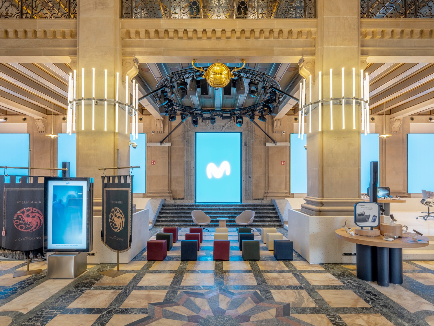
100 years of history, a new type of store
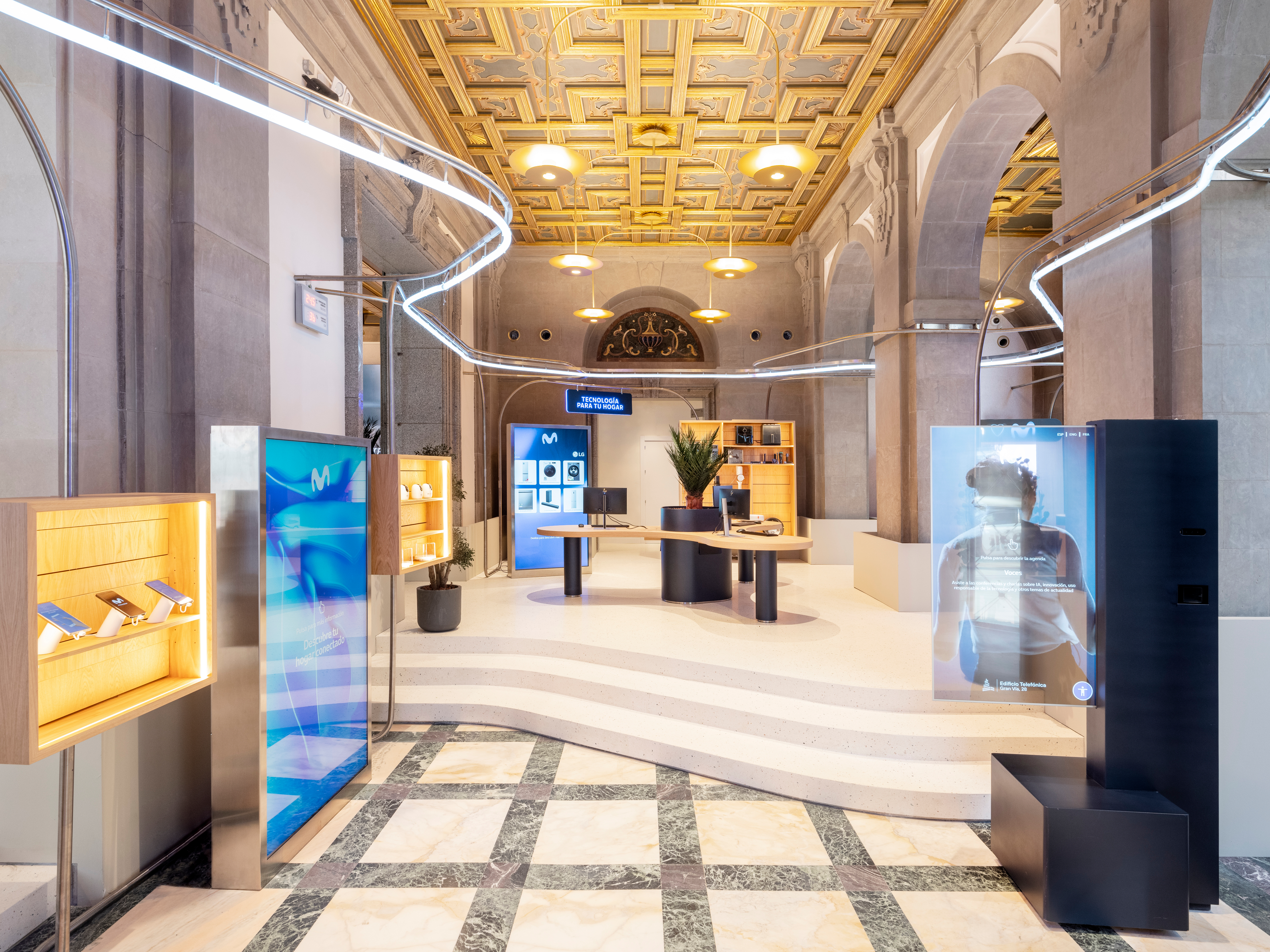
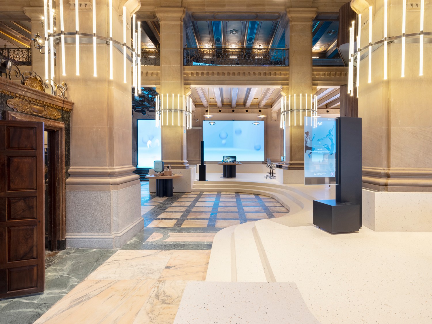
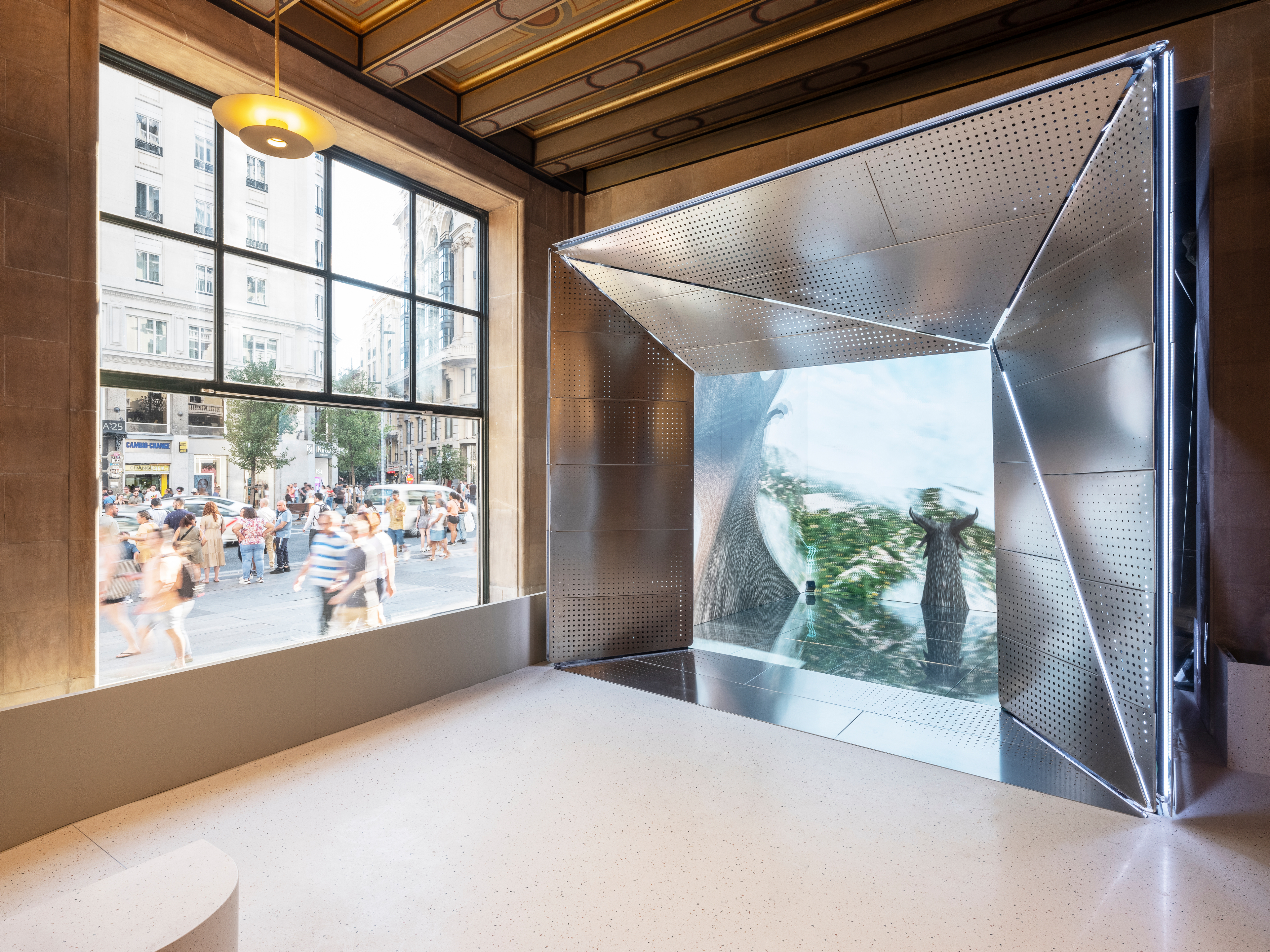
On the occasion of Telefónica's centenary, the flagship at Gran Vía 28 was completely renovated, both architecturally and in customer experience. The digital design had to integrate with the physical work — executed in parallel — and coordinate with multiple technology partners.
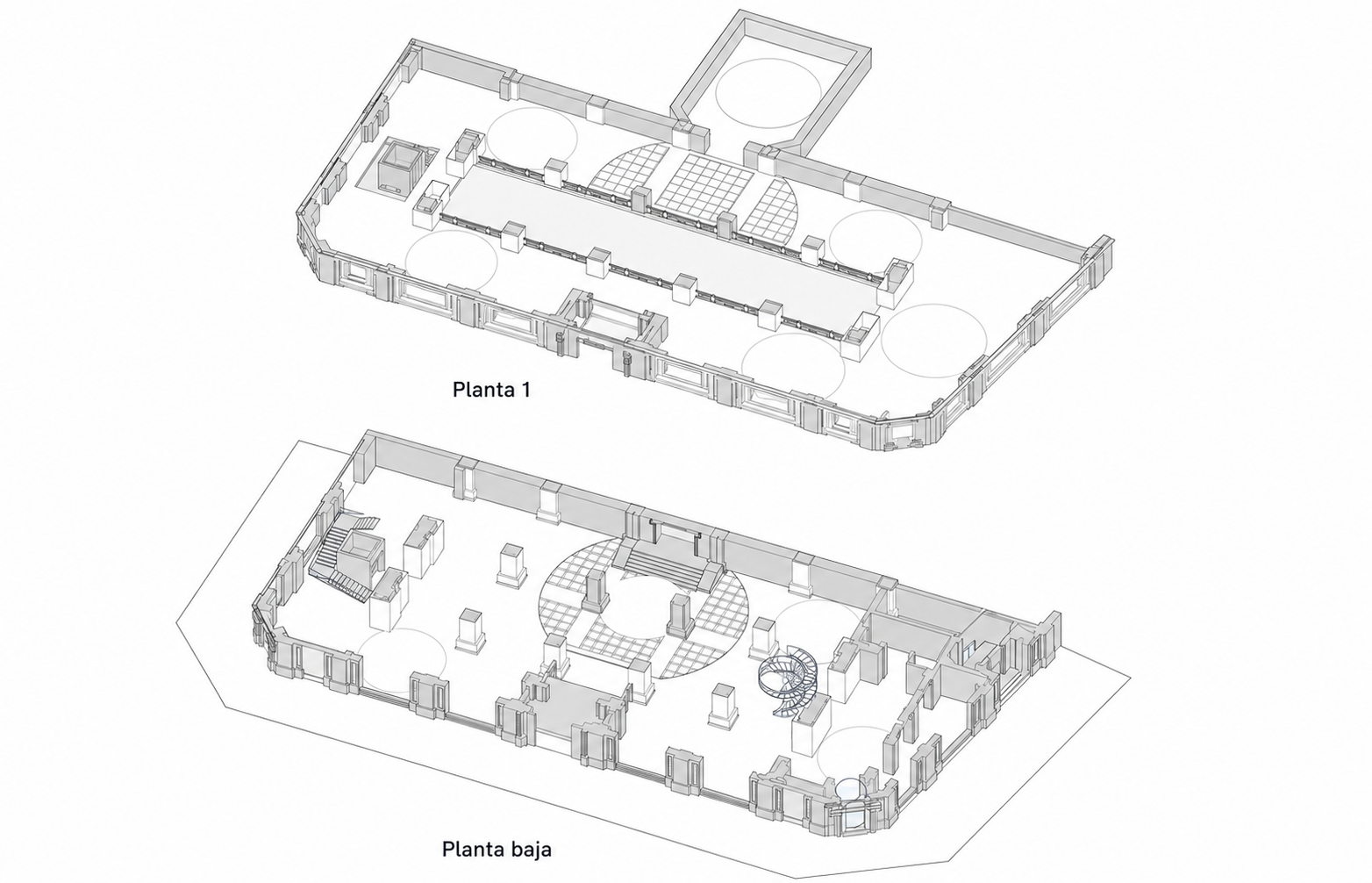
The space
The building works were parallel to the digital design: iterating over spaces that did not yet physically exist was the norm, not the exception. The service design had to anticipate how the customer would move through the space, how the staff would manage the virtual queue from their own app, and how each screen would seamlessly pass the baton to the next. UX decisions depended on both software constraints and square meters.
Each area of the building has a QR code or totem with a specific objective and CTA, mapped out in collaboration with the Movistar team.
The devices
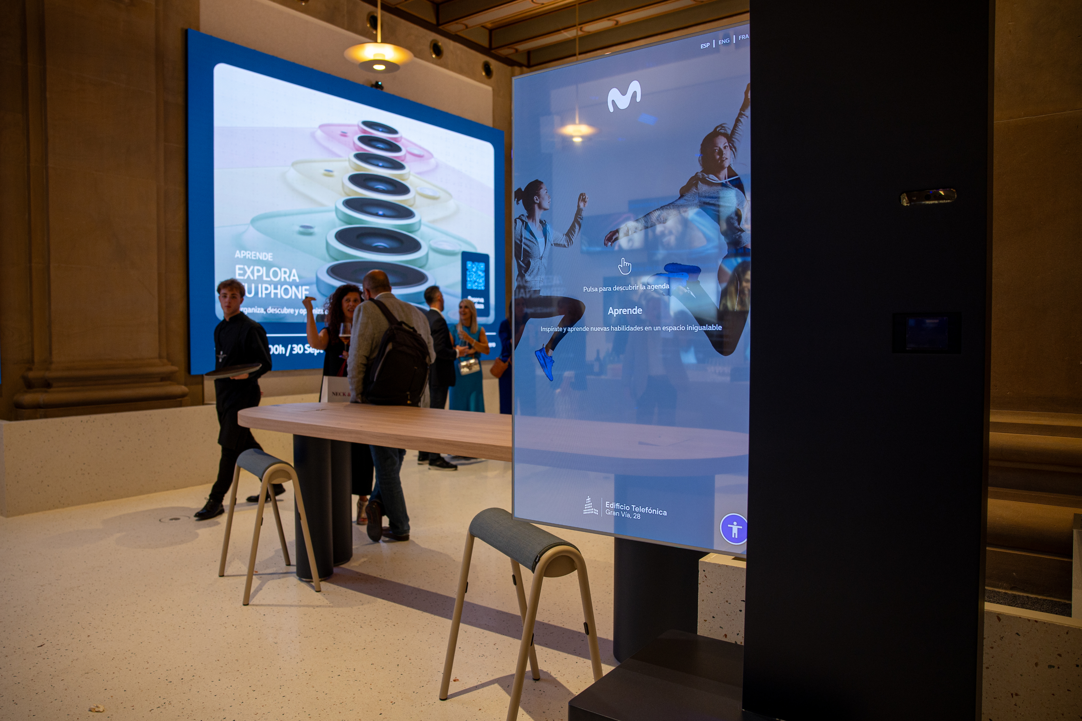
A PWA accessible through QR codes placed in different areas of the store, in-store totems with transparent screens, and a buyback kiosk. Each surface has its own technical, contextual, and accessibility restrictions. Both the PWA and the Totem allow us to access the agenda, receive personalised attention, and explore the space through an interactive map.
PWA
A website to navigate through the Movistar Space and all the functionalities it offers, such as scheduling an appointment, taking a number, or booking tickets for a workshop or talk.
INSTORE TOTEM
Several totems to navigate through the options offered by the space, book rooms, cinema tickets, take a number, or schedule an appointment for personalised attention.

BUYBACK CORNER
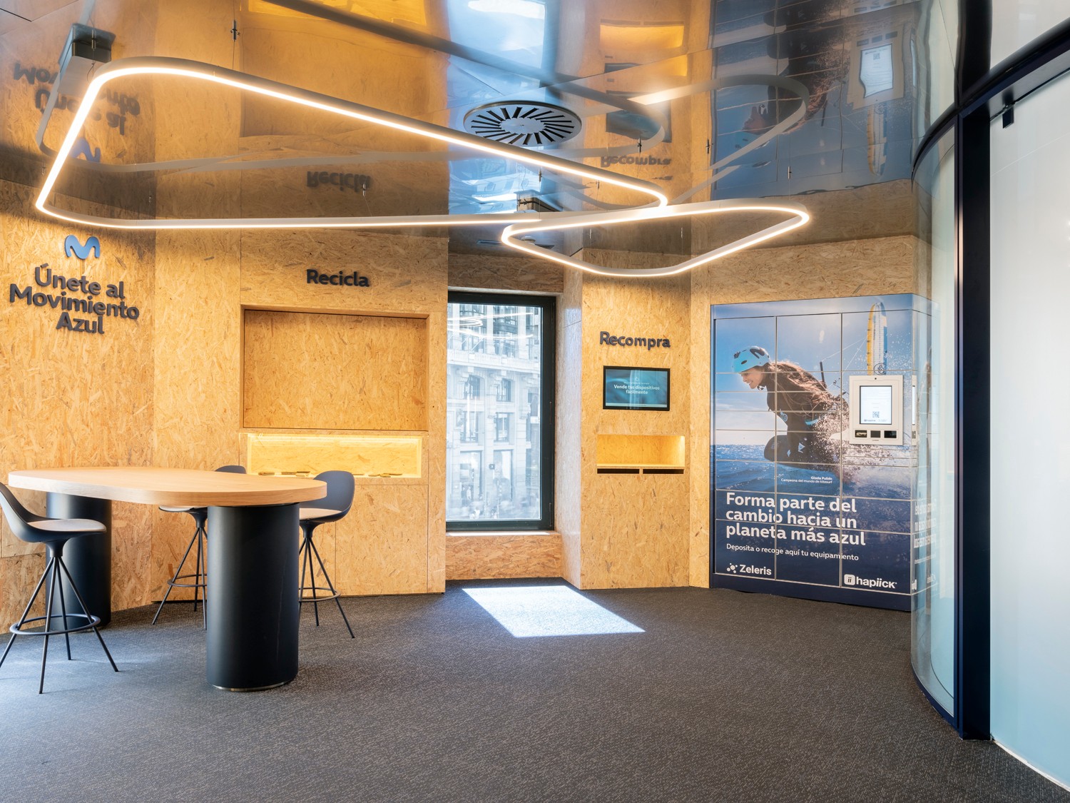
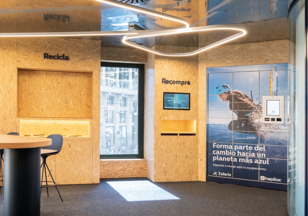
A corner that is part of the Blue Movement aimed at valuing and selling your old device. Completely unattended. The Blue Movement is a sustainability program with four pillars: Recycle, Repair, Buyback, and Refurbish.
Both from the PWA and the Totem, the same use cases can be accessed with the limitations of each device and depending on where the user is located.

INTERACTIVE MAP
An interactive map divided by floors where the user can view areas and services.


PERSONALISED ATTENTION
Un mapa interactivo separado por plantas donde el usuario visualiza zonas y servicios.

AGENDA
Un servicio para que el usuario pueda coger turno, registrar la llegada de su cita o agendar una cita. Con ello se genera una experiencia de cola activa virtual.
USE CASE 1
Commercial service with active queue
The customer arrives, scans the QR code for their area, and enters the PWA. From the Commercial Service section and depending on the type of service needed, the user will be able to:
Take a number
Register their appointment
Schedule an appointment
TIMING LOGIC DIAGRAM

Customer journey
A fundamental part during the design of this case was the design of the customer journey, aligned between the different teams and partners. Key technical integration: The queue flows (take a number, I come with an appointment, schedule an appointment) are integrated via iFrame from Quenda. The design challenge was to make the transition between the native views and those of Quenda seamless, maintaining Movistar's visual system. The confirmation and location views are indeed proprietary to JogoTech.
USE CASE 2
Experience Booking
Una progressive web app accesible desde cualquier smartphone —sin descarga— que actúa como guía y gestor de toda la experiencia dentro del edificio.
Agenda
List of different types of experiences and activities

Experience sheet
Descriptivo y calendario con slots de 30 min.
Reservation
Reservation data form.
Confirmation
QR code that can be added to the wallet. Push notification 30-15 minutes before the experience.
Access with PIN
For the Movistar Studio: the QR code generates a PIN that unlocks the electronic lock (Salto integration).
USE CASE 3
Buyback
Se trata de una experiencia en tienda en la que el usuario puede llevar dispositivos que no utiliza para ser recompensado con una transferencia de dinero o una promoción a aplicar en dispositivos nuevos. Conectado con la zona Movimiento Azul del primer piso como parte de la estrategia de economía circular de Movistar.
El usuario llega al punto de Movimiento azul, en la pantalla que esta integrada en la pared, selecciona el d
VALUATION DIAGRAM
Design decisions
Progress always visible
A stepper with states (done / active / pending) and the indicator "Step 3 of 5", illustrating why reducing perceived uncertainty matters as much as reducing actual steps.
Minimalist design
The kiosk is integrated into the space's architecture: it is not a portable device but a store element. The design reflects this with white backgrounds, large typography, a single primary interactive element per screen, and generous white space. There is no sidebar, no navigation menu, no secondary information competing for attention. The goal was to complete the process with minimal cognitive effort.
Reduce and simplify to the maximum
Each step of the flow was questioned: is it essential? Can it be merged with the previous one? Can it be deferred or eliminated? The aim was to reach the minimum number of screens that made the process viable. Steps like device evaluation were grouped into a single view with progressive questions, avoiding empty intermediate screens.
Learnings
Colour is not just aesthetics
On a transparent screen, black = invisible. The entire colour system had to be rethought and validated in the real space with variable ambient light before being approved.
Accessibility in a physical environment
WCAG standards do not cover screens at 2 metres high. Defining ergonomic interaction zones for users with different abilities required collaborative work with the interior design team.
The stitching between systems is design
Integrating 5+ third-party systems without the user perceiving the transition is a design problem rather than a technical one. Each transfer was prototyped and validated to maintain the visual coherence of Movistar.
Designing in parallel with the construction
Making UX decisions about spaces that do not yet physically exist requires documenting explicit assumptions and reviewing them with the construction team in each iteration.
Phygital experience for the Telefónica building
Comprehensive design of the flagship store where the physical and digital converge.
Duration 2023-2024
Product design
UX/UI Design
Service design
Totem
CONTEXT
100 years of history, a new type of store
On the occasion of Telefónica's centenary, the flagship at Gran Vía 28 was completely renovated, both architecturally and in customer experience. The digital design had to integrate with the physical work — executed in parallel — and coordinate with multiple technology partners.
The space
The construction of the building ran parallel to the digital design: iterating over spaces that did not yet physically exist was the norm, not the exception. The service design had to anticipate how the customer would move through the space, how the staff would manage the virtual queue from their own app, and how each screen would seamlessly pass the baton to the next. UX decisions depended on both software constraints and square meters.
Each area of the building has a QR code or totem with a specific objective and CTA, mapped out in collaboration with the Movistar team.
The devices
A PWA accessible through QR codes placed in different areas of the store, in-store totems with transparent screens, and a buyback kiosk. Each surface has its own technical, contextual, and accessibility restrictions. Both the PWA and the Totem allow us to access the agenda, receive personalised attention, and explore the space through an interactive map.
PWA
A website to navigate through the Movistar Space and all the functionalities it offers, such as scheduling an appointment, taking a number, or booking tickets for a workshop or talk.
INSTORE TOTEM
Several totems to navigate through the options offered by the space, book rooms, cinema tickets, take a number, or schedule an appointment for personalised attention.
BUYBACK CORNER
A corner that is part of the Blue Movement aimed at valuing and selling your old device. Completely unattended. The Blue Movement is a sustainability program with four pillars: Recycle, Repair, Buyback, and Refurbish.
Both from the PWA and the Totem, the same use cases can be accessed with the limitations of each device and depending on where the user is located.
INTERACTIVE MAP
An interactive map divided by floors where the user can view areas and services.
PERSONALISED ATTENTION
Un mapa interactivo separado por plantas donde el usuario visualiza zonas y servicios.
AGENDA
Un servicio para que el usuario pueda coger turno, registrar la llegada de su cita o agendar una cita. Con ello se genera una experiencia de cola activa virtual.
USE CASE 1
Commercial service with active queue
The customer arrives, scans the QR code for their area, and enters the PWA. From the Commercial Service section and depending on the type of service needed, the user will be able to:
Take a number
Register their appointment
Schedule an appointment
TIMING LOGIC DIAGRAM
Customer journey
A fundamental part during the design of this case was the design of the customer journey, aligned between the different teams and partners. Key technical integration: The queue flows (take a number, I come with an appointment, schedule an appointment) are integrated via iFrame from Quenda. The design challenge was to make the transition between the native views and those of Quenda seamless, maintaining Movistar's visual system. The confirmation and location views are indeed proprietary to JogoTech.
USE CASE 2
Experience Booking
Una progressive web app accesible desde cualquier smartphone —sin descarga— que actúa como guía y gestor de toda la experiencia dentro del edificio.
Agenda
List of different types of experiences and activities

Experience sheet
Descriptivo y calendario con slots de 30 min.
Reservation
Reservation data form.
Confirmation
QR code that can be added to the wallet. Push notification 30-15 minutes before the experience.
Access with PIN
For the Movistar Studio: the QR code generates a PIN that unlocks the electronic lock (Salto integration).
USE CASE 3
Buyback
Se trata de una experiencia en tienda en la que el usuario puede llevar dispositivos que no utiliza para ser recompensado con una transferencia de dinero o una promoción a aplicar en dispositivos nuevos. Conectado con la zona Movimiento Azul del primer piso como parte de la estrategia de economía circular de Movistar.
El usuario llega al punto de Movimiento azul, en la pantalla que esta integrada en la pared, selecciona el d
VALUATION DIAGRAM
Design decisions
Progress always visible
A stepper with states (done / active / pending) and the indicator "Step 3 of 5", illustrating why reducing perceived uncertainty matters as much as reducing actual steps.
Minimalist design
The kiosk is integrated into the space's architecture: it is not a portable device but a store element. The design reflects this with white backgrounds, large typography, a single primary interactive element per screen, and generous white space. There is no sidebar, no navigation menu, no secondary information competing for attention. The goal was to complete the process with minimal cognitive effort.
Reduce and simplify to the maximum
Each step of the flow was questioned: is it essential? Can it be merged with the previous one? Can it be deferred or eliminated? The aim was to reach the minimum number of screens that made the process viable. Steps like device evaluation were grouped into a single view with progressive questions, avoiding empty intermediate screens.
Learnings
Colour is not just aesthetics
On a transparent screen, black = invisible. The entire colour system had to be rethought and validated in the real space with variable ambient light before being approved.
Accessibility in a physical environment
WCAG standards do not cover screens at 2 metres high. Defining ergonomic interaction zones for users with different abilities required collaborative work with the interior design team.
The stitching between systems is design
Integrating 5+ third-party systems without the user perceiving the transition is a design problem rather than a technical one. Each transfer was prototyped and validated to maintain the visual coherence of Movistar.
Designing in parallel with the construction
Making UX decisions about spaces that do not yet physically exist requires documenting explicit assumptions and reviewing them with the construction team in each iteration.
Phygital experience for the Telefónica building
Comprehensive design of the flagship store where the physical and digital converge.
Duration 2023-2024
Product design
UX/UI Design
Service design
Totem
CONTEXT
100 years of history, a new type of store
On the occasion of Telefónica's centenary, the flagship at Gran Vía 28 was completely renovated, both architecturally and in customer experience. The digital design had to integrate with the physical work — executed in parallel — and coordinate with multiple technology partners.
The space
The building works were carried out in parallel with the digital design: iterating over spaces that did not yet physically exist. The design had to anticipate how the client would move through the space, how staff would manage the virtual queue from their own app, and how each screen would seamlessly pass the baton to the next. UX decisions depended on both software constraints and square meters.
Several QR codes and totems were placed in different areas of the building with a specific goal and CTA, mapped out in collaboration with the Movistar team.
The devices
A PWA accessible through QR codes placed in different areas of the store, in-store totems with transparent screens, and a buyback kiosk. Each surface has its own technical, contextual, and accessibility restrictions. Both the PWA and the Totem allow us to access the agenda, receive personalised attention, and explore the space through an interactive map.
PWA
A website to navigate through the Movistar Space and all the functionalities it offers, such as scheduling an appointment, taking a number, or booking tickets for a workshop or talk.
INSTORE TOTEM
Several totems to navigate through the options offered by the space, book rooms, cinema tickets, take a number, or schedule an appointment for personalised attention.
BUYBACK CORNER
A corner that is part of the Blue Movement aimed at valuing and selling your old device. Completely unattended. The Blue Movement is a sustainability program with four pillars: Recycle, Repair, Buyback, and Refurbish.
Both from the PWA and the Totem, the same use cases can be accessed with the limitations of each device and depending on where the user is located.

INTERACTIVE MAP
An interactive map divided by floors where the user can view areas and services.


PERSONALISED ATTENTION
A service for the user to take a number, register their appointment arrival, or schedule an appointment. This creates an active virtual queue experience.

AGENDA
A catalogue of different experiences within the space that the user can access.
USE CASE 1
Commercial service with active queue
The customer arrives, scans the QR code for their area, and enters the PWA. From the Commercial Service section and depending on the type of service needed, the user will be able to:
Take a number
Register their appointment
Schedule an appointment
TIMING LOGIC DIAGRAM
Customer journey
A fundamental part during the design of this case was the design of the customer journey, aligned between the different teams and partners. Key technical integration: The queue flows (take a number, I come with an appointment, schedule an appointment) are integrated via iFrame from Quenda. The design challenge was to make the transition between the native views and those of Quenda seamless, maintaining Movistar's visual system. The confirmation and location views are indeed proprietary to JogoTech.
USE CASE 2
Experience Booking
This functionality allows the user to book tickets for workshops, talks, cinema, the Movistar Studio, or recording studio reservations.
Agenda
List of different types of experiences and activities

Experience sheet
Descriptive sheet and calendar with 30-minute slots.
Reservation
Reservation data form.
Confirmation
QR code that can be added to the wallet. Push notification 30-15 minutes before the experience.
Access with PIN
For the Movistar Studio: the QR code generates a PIN that unlocks the electronic lock (Salto integration).
USE CASE 3
Buyback
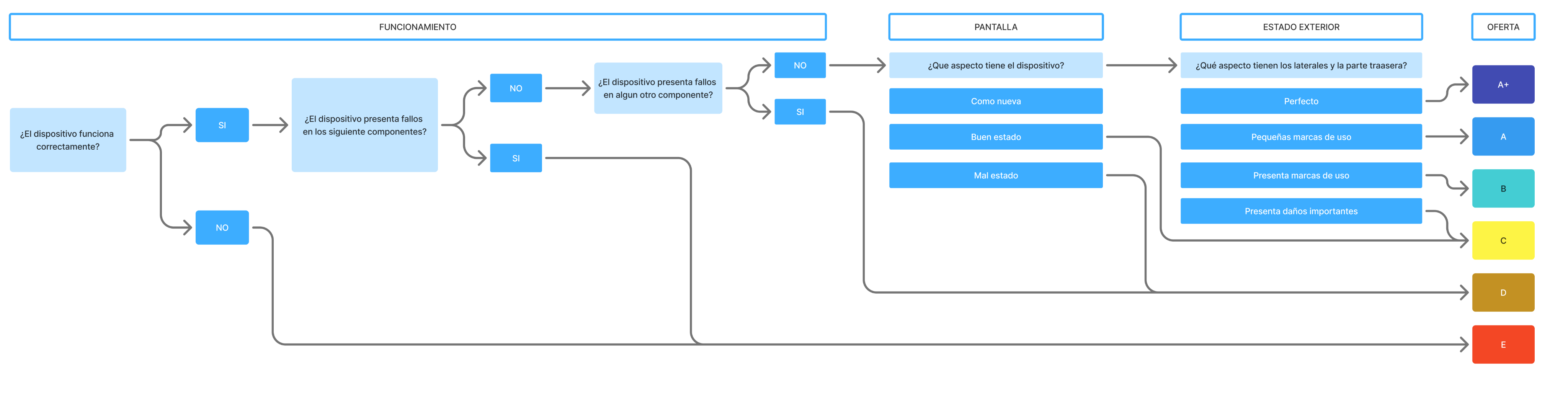
This is an in-store experience where the user can bring in devices they no longer use to be rewarded with a cash transfer or a promotion applicable to new devices. It is connected to the Blue Movement area on the first floor as part of Movistar's circular economy strategy.
The user arrives at the Blue Movement point, selects the device they wish to recycle on the integrated screen in the wall, and from there will need to follow a series of steps to obtain an appraisal.
VALUATION DIAGRAM
Design decisions
Progress always visible
A stepper with states (done / active / pending) and the indicator "Step 3 of 5", illustrating why reducing perceived uncertainty matters as much as reducing actual steps.
Minimalist design
The kiosk is integrated into the space's architecture: it is not a portable device but a store element. The design reflects this with white backgrounds, large typography, a single primary interactive element per screen, and generous white space. There is no sidebar, no navigation menu, no secondary information competing for attention. The goal was to complete the process with minimal cognitive effort.
Reduce and simplify to the maximum
Each step of the flow was questioned: is it essential? Can it be merged with the previous one? Can it be deferred or eliminated? The aim was to reach the minimum number of screens that made the process viable. Steps like device evaluation were grouped into a single view with progressive questions, avoiding empty intermediate screens.
Learnings
Colour is not just aesthetics
On a transparent screen, black = invisible. The entire colour system had to be rethought and validated in the real space with variable ambient light before being approved.
Accessibility in a physical environment
WCAG standards do not cover screens at 2 metres high. Defining ergonomic interaction zones for users with different abilities required collaborative work with the interior design team.
The stitching between systems is design
Integrating 5+ third-party systems without the user perceiving the transition is a design problem rather than a technical one. Each transfer was prototyped and validated to maintain the visual coherence of Movistar.
Designing in parallel with the construction
Making UX decisions about spaces that do not yet physically exist requires documenting explicit assumptions and reviewing them with the construction team in each iteration.